
Building websites used to be an easy task. We only had a handful of browsers we needed to test to ensure our websites would display correctly. Unfortunately, nowadays there are more devices and ways to view a website then every before. Which means there is a greater chance that your website will not display correctly. To avoid this problem we need to turn our static pages into more responsive ones. One way to do this is by using Bootstrap. Bootstrap is one of the most popular HTML, CSS, and JS frameworks designed to make websites responsive on virtually any device. Let’s look at what it would take to use Bootstrap.
Getting Started
 Before we begin using Bootstrap, you will need to download the Bootstrap files to your server. Go to the Bootstrap Getting Started page and look for the “Download Bootstrap” button. Click this button to start downloading the zip file. Once the files have downloaded, you will need to uncompress them with an unzip tool. If you do not have one I recommend using 7-zip for Windows and if you are using Linux (or Mac) use yum or apt-get to install unzip.
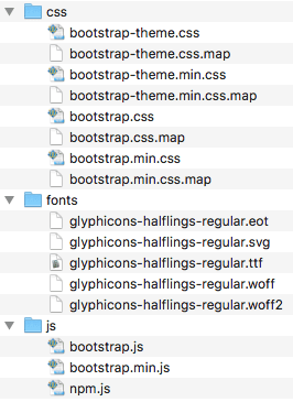
The zip file will contain three folders (ass seen on the right). One folder for the Bootstrap CSS, Javascript, and Font files. You will need to place these files onto your web server. Put them in the root directory of the website. If you already have a CSS, fonts, and js folders, go ahead and move the corresponding files into those directories. Otherwise, you will need to create the folders first before copying the files over.
Setup Note:
- Make sure to copy over the minified versions of the CSS and JS files. These are the files ending in *.min.css and *.min.js.
- If you wish to use the glyph icons files, then you need to place all of the glyph files into your fonts folder.
What is the difference in the files types?
Both the *.css and *.js files have the same functionality as their *.min counterparts. With the exception, that the *.min one has all unnecessary characters removed to make the file size smaller and quicker to load. Which means you are better off using the minified version (.min) for your live environments. Especially since Google and other search engines are using page load times in their search algorithms. Therefore, by using the minified files your site will load faster and will improve your score in the search results.
Using Bootstrap CSS
Before you can make your site responsive with Bootstrap CSS, you need to add a link to bootstrap.min.css file. Use the HTML <link> element to refer to an external CSS file. Place it inside of your web pages <head> tag. Like so:
<link href="css/bootstrap.min.css" rel="stylesheet">Now to ensure your site stays responsive you need to use the Bootstrap CSS styling attributes. Using these styles may require a drastic overhaul to your existing site and CSS. Not to mention a different way of thinking about how you go about designing your site. For instance, you will need to get in the habit of using HTML containers. Such as <div> and <span> tags to layout the elements of your site.
Using Containers
The whole point of responsive design is to provide a way for your website to be visible from any device without having to create a static page for every device on the planet. Bootstrap does this by using containers to wrap our content in a neutral way. Then you can apply Bootstrap attributes to your containers. These styling attributes will tell the device how to render the containers and display your content.
Using the Grid
The most recognizable of these features in Bootstrap is the Grid system. Which allows us to think of our pages as a set of rows and columns in which we can place our content.
“Bootstrap includes a responsive, mobile first fluid grid system that appropriately scales up to 12 columns as the device or viewport size increases. It includes predefined classes for easy layout options, as well as powerful mixins for generating more semantic layouts.” –Bootstrap
Here is an example of using the grid to create three equally sized columns. The content widths will resize equally as the screen resolution or browser is reduced.
<div class="container-fluid">
  <div class="row">
    <div class="col-sm-4">
    </div>
    <div class="col-sm-4">
    </div>
    <div class="col-sm-4">
    </div>
  </div>
</div>
Additional Resources
To help you get going quickly, we have put together a list of some of the key Bootstrap styling components you will be using. For a full list of what using Bootstrap CSS has to offer, check out their website. We have also found these sources to be ideal for learning more about Bootstrap and Responsive Design:
Bootstrap Properties Reference offers a better idea of what properties and classes exist for Bootstrap.
Learning Responsive Web Design: A Beginner’s Guide
Responsive Web Design with HTML5 and CSS3 Essentials