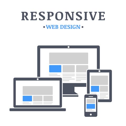
What is Responsive Design?
With the explosion of IRDs (Internet-Ready Devices), the ability for website designers to build beautiful static websites had become challenging. One way they can tackle this problem is by creating multiple versions of their website in different resolutions and layouts. Unfortunately, this is time-consuming and impractical. That is where responsive design come into play. With responsive design, you start by creating a single website design that can conform to any screen and orientation regardless of device or browser. So no more having to build multiple versions of your site.
How do we make our Designs Responsive?
We create responsive website designs by using flexible layouts, flexible images, and cascading style sheet media queries. Which can be done using various techniques with HTML, CSS, and JavaScript? However, the concept of responsive design is not new anymore. You no longer need to build your sites responsive design from the ground up. Instead, you can use styling framework libraries like BootStrap, Foundation3, or Skeleton (to name a few). These frameworks provide you with all the styling classes, templates, and layout options. All you need to do is download them and apply their framework to the design of your site.
How Does it Work?
We start by changing the way we think about how we build a web page and put it together. So, if you plan on building your own responsive design or use a framework, the concept is the same. Begin by turn you web page layout into a grid. Similar to that of the old Hasbro Battleship Game (A4, Hit you sank my battleship) or graph paper. The same concept applies here. By using the grid, we can position our page elements into distinct quadrants. Allowing us to apply the responsive styling rules to the grid instead of our individual elements.
Let’s start by looking at an example:
In this example, we are viewing Develpreneur.com in full-screen mode in a browser. As you see, we have page navigation at the top, content down the middle of the site, and a sidebar on the right.
Here is a case of it being Non-Responsive:
If our site was not responsive and we tried to view our page from an iPhone, we might see this. All of our content, navigation, and sidebars are still there, but they are no longer easily accessible.
On a phone, the normal page flow of a site is up/down and not right/left. Since this example is non-responsive, the user would have to try and navigate right/left if they wished to see everything on the page.
Here is a case of it being Responsive:
When we make out site responsive the page conforms to the layout orientation on the device and keeps the page viewable in an up/down manner. Now, we can see that everything is still viewable. For instance, our top navigation has shrunk to be a menu button. All of our relevant content is viewable. Finally, even though you do not see the sidebar, it is still there. It has been moved to the bottom of the page and is visible if you scroll down.
Additional Resources
We have found these sources to be ideal for getting started with Responsive Design:


