
When website design began, individuals and businesses used HTML to create their web pages with static content. We then display this context in web browsers with a max resolution of 800×600. At first, there were only a few browsers that could render these pages IE or Netscape. As the internet grew in popularity so did the frameworks surrounding website design. As more and more people wanted sites, the limitations of HTML for creating complex site designs required a change. Custom style sheets (or CSS) emerged out of HTML to handle complex models. Now HTML’s sole purpose is for laying out the building blocks of a site. Whereas, CSS is responsible for the formatting and styles. These give Developers more control and flexibility for building very vibrant and stylish web designs.
Today users have a choice of which browsers and devices the use. That means we now have to be aware of how a site will render on a particular screen resolution. What exactly does this mean? So, your website may look great on a desktop, but not on mobile devices. This compatibility issue arises because mobile devices typically use different screen resolutions. Therefore, when a page displays on a device, it may be cut off, unreadable, or unusable. In many cases, a site has to contain many versions of a page to address this problem. Unfortunately, this is both time consuming, expensive to maintain, and almost impossible to manage. Therefore, we turn to responsive design to come up with the solution. Here is what we will be covering in this section.
What we will cover:
- Responsive design overview
- What is Bootstrap?
- Setting up Bootstrap
- Bootstrap Basics
- Using Bootstrap
- The key approaches Bootstrap
- Extending Bootstrap
Class Goal: Student will have a better understanding of using responsive design. Apply Bootstrap styling to their marketing website (grown from the earlier version) to make it a responsive site.
Responsive Design Overview
The ability to create web pages that automatically change and adapt based on the device’s resolution. This way a web page will always be rendered in a way that is both readable and functional.
There are a couple of ways in which one could go about creating a responsive design:
- Create custom responsive CSS templates
- Use existing prebuilt frameworks (such as Bootstrap, Google’s Material, Materialize)
Custom Templates:
One advantage of creating custom templates is the ability to have full design and customization control over a site’s design. However, this level of scrutiny can be costly in both time and resources. That is why for beginners we do not recommend creating complex, customizable templates. Instead, we want to apply responsive design patterns through the use of a framework (like Bootstrap). This will ensure your site stays responsive.
What is Bootstrap?
Bootstrap was one of the first responsive design libraries available. It is still considered one of the most widely used HTML, CSS, and JS frameworks out there for responsive design. Bootstrap also has an extensive library to choose from of prebuilt themes. All these pieces help reduce the amount of setup or customization to make a design.
Setting up Bootstrap
Let’s start by downloading Bootstrap:
- Open up a browser and enter the location “http://getbootstrap.com/getting-started/”
- Click the “Download Bootstrap” button and select a location to save the file to your Downloads folder.
Setup Bootstrap for our Windows development environment:
- Unzip the file (with either Windows zip tool, 7zip, or WinZip).
- Open the new Bootstrap folder
- Open the CSS folder for distribution files.
- Copy the “bootstrap.min.css” file to our projects WebContent/css.
That’s it. You can now start using Bootstrap with your web pages.
Note: If you are using a deployment script, these files will go out in your next deploy. However, if you are manually pushing your files, then you will need to FTP the “bootstrap.min.css” file to “var/www/html/css” folder.
Bootstrap Basics
Bootstrap comes with a variety of prebuilt CSS styles (or classes). These classes make switching from a non-responsive to a responsive site painless. The class components libraries fall into three parts. These are layouts (or containers), CSS content (or element like), and components (build in features like navbars, jumbotrons, and groups). The layout handles the page layout (or container), which is responsible for structuring the design, scaffolding, and media queries. Whereas the content is in charge of displaying the content like typography, code, tables, forms, buttons, and images. The components comprise a set of over a dozen reusable components. These component include iconography, dropdowns, input groups, navigation, alerts, and much more.
Using Bootstrap
To use the Bootstrap include the following line of code in between the <head>..</head> tags of your web page.
<link rel="stylesheet" href="./css/bootstrap.min.css">
Note: the href is pointing you install path “./” is the root of your domain. This root folder lives in “/var/www/html/” on the AWS server. If you have multiple domains on a server, you will need to specify the full path to the file. For example: if the root folder of your domain was “/var/www/html/members” then the href would be “./members/css/bootstrap.min.css”. When in doubt use the absolute URL “http://your.domain.com/members/css/bootstrap.min.css”.
Let’s create a simple HTML file to test our Bootstrap install. In this example, we will render a standard HTML link as a button. To do this, we need to use the Bootstrap “btn btn-default” classes to make the link look like a button.
Without Bootstrap:
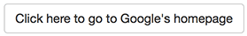
<html>
    <head>
        <link rel="stylesheet" href="./css/bootstrap.min.css">
    </head>
    <body>
        <a href="www.google.com">Click here to go to Google's homepage</a>
    </body>
</html>
When the code displays in the browser you will see the following:
Click here to go to Google’s homepage
With Bootstrap:
Let’s modify the link above. Now add a class reference to “btn” and “btn-default”. Remember you can add multiple CSS class references separated by a space. So the new link should look like this:
<a class="btn btn-default" href="www.google.com">Click here to go to Google's homepage</a>
When loaded, the code will change the link has turned into a button like this:
It’s that easy. Now you can use any of the Bootstrap classes to create a responsive web page.
The Key Approaches to Bootstrap
Bootstrap makes use of individual HTML elements and CSS properties that require the use of the HTML5 doctype. So make a habit of including DOCTYPE at the beginning of all your projects. This way you will guarantee your Bootstrap components will work.
<!DOCTYPE html>
<html lang="en">
 ...
</html>
Understanding Containers
Containers use a grid (or table) like structure to store a group or set of contents (elements) together. These containers require the use of a <div> tag to wrap the contents using one of the grid system classes “container” or “container-fluid”. If you want to make your grid responsive with a fixed width container, use the “container” class. For a full-width container, spanning the entire width of your viewport, use “container-fluid”. Neither container should wrap inside another (or nestable) due to the way the containers handle padding.
Extending Bootstrap
One of the nice features of Bootstrap is its CSS libraries. However, there may be times where you want to change the overall look and feel of your Bootstrap instance. You could dig into the bootstrap CSS files and make the changes there. Although, that can be tedious and hard to maintain when rolling to new versions of Bootstrap. The ideal way is to create your custom CSS files that override the bootstrap classes you wish to change. Then simply replace the Bootstrap CSS, and load your custom CSS file in your page’s header.
Assignments
- Install Bootstrap onto your web server.
- After you install Bootstrap, add Bootstrap import link to your web pages.
- Load up your site and see what happens. Do you notice any differences? If not why?
- We have modified the code changes to include Bootstrap. These are available here. Review the changes and go back to your marketing site and replace your CSS with Bootstrap classes. For additional properties check out Bootstrap Properties Reference.
When you are ready, it is now time to move on to the next step: Measuring Your Site Success – Configuring Analytics.
Further Reading
We have found these sources to be ideal for learning more about Bootstrap and Responsive Design:
Bootstrap Properties Reference offers a better idea of what properties and classes exist for Bootstrap.
Learning Responsive Web Design: A Beginner’s Guide
Responsive Web Design with HTML5 and CSS3 Essentials
[sgmb id=”1″]