
One of the first things anyone does with a newly created website is to add some images. Working with images is important throughout the site creation process, but it seems like creating those few anchor images give us a framework to build on.
These images may be used for a banner, a logo, or even a background. Unfortunately, aligning the images can be a pain when you are getting started in the web development world. Thus, there is no time like the present to look at the ways to integrate images into your site.
In this article, we are going to look at banners, aligning text around images, backgrounds, and adding colors. Then we will look at how CSS can help make all of this an easier task.
Header and Footer Banners
First, we will start with a header image. Grab a picture you want to work with or use the example code from below. The simplest way to add an image is just through the tag.
<div class="header"><img src="images/celebrationbanner.jpg" alt="picture of fireworks"></div>
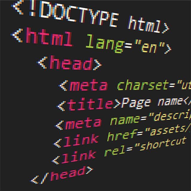
In the example, we assign a class of header to our code snippet to help us in the future. Place this as the first item in the HTML body right after the opening tag. Note that the alt tag is provided for the image to make it compliant with accessibility guidelines. Alt tags are an important part of being friendly to more users and get a good grade from search engines.
Now you will notice the image does not fill the screen and may not align with the top of the screen. The size may not look right either. HTML version five has pushed coders to use CSS over inline styles. This new approach means that very little of our control over images still exists in the image tag. We can change the size and not much else. To show this add the properties width=”100%” and height=”75″ to the “img” tag. Now you will likely see a skewed image that fits the page a little better.
Working With Images and Text Alignment
We will come back to that header later. For now, let’s move on to another image and some text.
 <img src="images/homePage.jpg" alt="home page pic" height="300">
 Actions Last Week:<br/>
 1. Setup my AWS server<br/>
 2. Created a basic web site<br/>
 3. Created my WordPress site<br/>
Add this text to the body below the first image. Now you will see the picture and the text beneath it. To flow text around the image, we will use a style command. Add the property style=’float: left’ to the “img” tag. Then you will see the text flow up to the top of the image while the image hugs the left of the screen. Switch the value to right to push the image to the right side of the screen.
Background Images and Colors
Sometimes we want a background color for our site, and sometimes we want an image. This is easily done by adding a property to the body tag. Add this as a property to the body tag (within the brackets of <body>)
background="images/homePage.jpg"
Now you will see the image fill the page as a background. For a color, change the tag to “bgcolor” from “background” and provide a color in the double quotes. Unfortunately, the image will fill the background based on its size. Therefore, once the page is larger than the image, you will see a non-image background. We will fix that with CSS.
Working With Images in CSS
As we noted, all of this s much easier when you use CSS. I tend to use a master CSS file for the site and then might need a few others to cover sections of the site differently. For example, I use an extra CSS file to cover the main marketing pages for a site and one that covers the heavy content pages. Include a CSS file with this line
<link href="css/mysite.css" rel="stylesheet">
All you have to do is change the mysite.css filename to the one you use. Let’s focus on the body, for now, to keep it simple. In the main file change the “body” tag back to simply “<body>.” We can override CSS styles at the page level, so we don’t want to do that. Now add this to your CSS file.
body {
padding-top: 0 px;
font-family: Georgia, "Times New Roman", Times, serif;
background-image: url(../images/homePage.jpg)
}
When you look at the page, the background image will be there, and the body will start right at the top of the page. Change the padding-top value to 50 px to see how it makes a difference. You can find a small image, and you will see it repeat as the page size grows. By default, images grow in the X and the Y directions. You can add a property background-repeat to control this. Here are the options for that.
background-repeat: repeat-x; # repeat the image horizontally

background-repeat: repeat-y; # repeat the image vertically

background-repeat: no-repeat; # does not repeat the image at all
Use these options with small images to create gradients and other patterns. If you list multiple images in the background-image property, then it will display them in order left to right.
Bootstrap and Responsive Images
In bootstrap, we have some great shortcuts for our images. We can just add the bootstrap CSS (<link href=”css/bootstrap.css” rel=”stylesheet”>) and then we will have some image class types available. Try this one out.
<img src="images/celebrationbanner.jpg" class="img-responsive img-circle" alt="picture of fireworks" >
Note that we removed the height and width parameters as the “img-” classes handle that for us. As you grow and shrink the browser width, the size will adapt. Remove the “img-circle” class to see your rectangular image grow and shrink as needed. The “img-responsive” tag is a quick way to make all of your bootstrap images responsive. Check out the reference page for some more options.
As you can see, images are easy to work with even though there are plenty of display options available. This is just the tip of the iceberg in options available, but it should cover the most common image needs for a site. When in doubt do an Internet search to find pages of examples or shoot us an email at [email protected].
You can find the sample code and images here: HTMLCSS-SampleCode
Further Reading
If you want to dig a little deeper on this topic, we suggest the following articles and sites.
CSS Zen Garden – A quick way to see the real power of CSS