
As the importance of websites increases, we see tools to help measure their impact. One example (of many) is the availability of heatmap tools. These reports are easy to use due to their visual nature, but let’s dig into what we should be seeking.
Heatmap Defined
First, it helps to be clear on what a heat map is. Heatmap tools track clicks on a web page. Every click and where it occurs is tracked. This can be for every user or some random percentage of users. Ideally, every click should be monitored. Thus, you will see typical paths through your page as well as outliers.
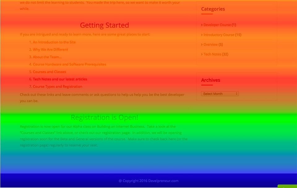
The reporting of these tracked clicks is often presented as an overlay of dots on your web page. Every dot represents a click. In many cases, multiple clicks on the same location are represented by a larger dot based on the number of clicks. Thus, the report may show very large dots centered on a popular click location.
In the case of pages that provide scrolling, there may also be tracking of the scroll bars. This is reported in a rainbow of colors usually with lighter ones showing for highly viewed portions of the page (the top for example). The colors get darker for less seen areas of the page.
Things to look for
Once we have data from our users, we will have a report with a bunch of dots on it. However, there are considerations to keep in mind while reviewing the report.
First, we want to make sure the links, buttons, and calls to action are regularly utilized. There should be some clicks around every “clickable” control on the page. When a link is rarely (if ever) used, then maybe it is not worth providing, or user education is required. Consider that the control is not being used because it is not intuitively available.
Second, look for clicks on non-clickable areas. For example, you can have an image with a call to action and a clickable button right next to the image. When the report shows that the image is often being clicked that suggests that you provide the button click functionality from clicking the picture as well. It may seem a small thing to make a change like this. However, little things can add up to changes in your conversion rates. Squeeze all you can out of every page.
Finally, look for clicks on items or text that does not seem to be a call to action. You might have a link too far away from the call to action. On the other hand, you might see an opportunity for a new product or service.
Finding Heatmap Tools
After this post, you may be ready to use a tool, but have no idea where to find one. There are many options available. Some of these are free or offer a trial period, while others have a paid subscription model. Although I am providing a short list here, a Google search of heatmap tools is likely to produce a current list of top players.
Note that many of these tools provide far more than simple heatmaps. I find all of them to be very useful and deciding among them is hard other than pure price-based comparisons. I have a comparison report I created for a customer that I will share along with some context for it if you send an email to [email protected]. Also, please leave comments on your experience with these tools, or others, to help us all make the best decision among heatmap tools.